 Amber Neely
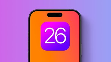
Designer Sebastiaan de With imagines what Apple's upcoming OS redesign might look like ahead of WWDC 2025.
With WWDC less than a week away and Apple dropping hints that changes are coming, everyone is curious about what the Cupertino-based tech giant has up its sleeve. We're nearly positive that there's a big change coming to Apple's operating system's designs, and we're quite certain that it'll take cues from visionOS.
But, even knowing that, we still don't know entirely answer what it will look like.
Sebastiaan de With, a designer and co-founder of Lux, known for apps like Halide, Kino, Spectre, and Orion, has some thoughts on the matter. In a new post on the Lux blog, he takes the time to examine what he thinks could be coming down the pipeline, and what could have spurred Apple to make another big change over a decade after the last one.
The majority of the post focuses on the history of iPhone design, covering Apple's design ethos throughout the ages. It starts with the very first iteration of iOS, covering how Apple heavily relied on skeuomorphism or the act of creating a digital interface that mimics a physical object.
The practice was, more or less, deemed necessary as we replaced many of our physical objects with digital ones. de With highlights the old Voice Memo app interface as a perfect example — it used to feature a radio-style metal microphone, versus the slimmed-down, single button interface we've had for quite some time now.
 Voice memo app on iOS 6 vs iOS 18
While skeuomorphism is helpful for transitionary periods, there comes a point where designs can be refined. Generation Z, or kids born between 1997 and 2012 have largely grown up online, with many of them having interfaced with smartphones and tablets from a young age. This goes doubly so for Generation Alpha.
A metal microphone wouldn't mean much to them — it barely means much to me, and I'm nearly 40. So, skeuomorphism goes the way of corded telephones, manual car windows, and foldable maps you stash in your glove box.
In 2013, Apple introduced iOS 7, which had — to put it lightly — mixed reactions at best. It was a dramatic change that pulled away from skeuomorphism and all the things that came with it — faux metal, gradients, and mimicry of things like road signs and notebook pages.
The author points out that this was Apple's transition into "flat design" — a design that didn't rely on mimicking a physical button one could press. One of the best examples is the Calculator app, which has one of the most dramatic shifts between iOS 6 and iOS 7.
But, it wasn't entirely flat; Apple introduced dynamic effects to imply depth. This gave the overall design of iOS 7 a significant amount of fluidity — one that Jony Ive was quite proud of.
So what comes next? We're all pretty sure that Apple's getting ready to shake up how iOS — as well as all its other operating systems — look.
It's likely that Apple does want to standardize its design across devices; after all, Apple would prefer its customers stay firmly in the Apple Ecosystem. By creating a unified design, Apple encourages users to switch from iPhone to Mac to iPad to Apple Watch — after all, if they all look the same, then there's a dramatically decreased learning curve.
 Image Credit: Sebastian de With, Lux
And so, de With speculates that Apple may try to emulate the feel of augmented reality, even on non-visionOS devices. He calls the concept "Living Glass."
It's a smart guess, especially considering that Apple has tagged WWDC 2025 as the "sleek peek" event. Apple has also allegedly reached out to third-party retail employees to help them "about what's possible when hardware and software are designed together."
Apple sent a message to 3rd-party retail employees about #WWDC25:
— Aaron (@aaronp613) June 2, 2025
Join live at 10:00 a.m. PT and be among the first to learn what's new from Apple.
Then check for resources to help you talk to customers about what's possible when hardware and software are designed together. pic.twitter.com/FhK1nKIc7Q
That's why de With suspects that Apple will lean heavily on dynamic effects and behaviors — similar to those that make the Dynamic Island work. His designs are gorgeous, and they certainly feel like they could have easily been designed by Apple itself.
The overall effect is a UI that not only enhances the user experience but blends seamlessly into it. We can only hope Apple has something this thoughtful in store.
Of course, this is all speculation. While some have suggested that they've gotten their hands on leaked screenshots of iOS, we rarely get much of a heads up before WWDC.
For now, we can spend as much time as we'd like prognosticating about what Apple's got in store for iOS, iPadOS, watchOS, and its other platforms — the sky's the limit. The only way to know for sure what Apple has up its sleeve is to actually hear it directly from Apple.


-m.jpg)


 Andrew O'Hara
 William Gallagher
 Marko Zivkovic
 Christine McKee
 Charles Martin
 Malcolm Owen


12 Comments
I also think there's a third leg to stand on here, and one not mentioned in the story:
VisionOS.
Because building and redesigning iOS and Mac apps to support the "Living Glass" metaphor also just happens to make it much, much easier to port applications to the Vision Pro.
Is that the sole reason? Of course not. Unifying the design language across the board makes for a more coherent user experience for those within Apple's ecosystem.
Nasty. After all the moving forward, we are going back to skeuomorphism? Please God no. It was fun for a long time, then we moved on to a more authentic, refined, and clean UI/UX. This just looks like a giant backwards step.
I don't disagree with the gist of what you're saying, but you probably couldn't have chosen a worse example than the microphone. Big, radio-style mics are arguably more popular than ever with younger generations thanks to the boom in streaming and podcasting. And considering the gen alpha and Z embrace of old analog tech like cassette tapes, I have to think someone is making a big mic with a retro metal look like the one pictured here from iOS 6.